Evaluation

     The Final Image

This is the image i have chosen for my final image, i had imaged the images to be different as i had more props and different outfits to change into for the photo shoot but things don’t always go accordingly to plan. I wanted to give off more of a equality feel to the photos by adding posters in we had written saying words like black and white together, equality, peace and love. In my previous posts i have spoke a lot about Helmut Newton and i do feel he is my preferred photographer and i did want to try capture an image that would be similar to his work, Helmut was partially colour blind and when colour was used he would like them to be bright and bold. I feel within my picture i have captured this with the brightness of the leaves in the back ground and mine and Carolinas dresses, i had used colour balance ( CMD+B) to play around with the colours.
I would improve my image by maybe planning more time, we had an hour to shoot which sounds like enough time but we could of used with having more time so we could look over our location and our setting as their were other locations on the set i would of liked to got pictures taken, also as i previously mentioned we was unable to do our clothes swap or use our props which would of made a different to some of our photographs. If we was able to do our clothes swap we would of been able to show off the hippie side of 1960’s which was what we had initially planned to do, we had left the other items on our coach which we thought we was able to go back to and change but we was unable to do this which was unfortunate as i felt these would of been lovely shots to take.
I had received some feedback from members of my class which had advised majority of them felt the image was framed they felt the positioning of me and Carolina being central worked well also the fact there are no half tree’s or anything cut off on the outer area of the photograph. I was advised that the shadow in the bottom right of the picture could of been removed to improve the image as well as most my piercings being removed using the spot healing tool.
I personally feel the image is not vogue material as there are normally never 2 people of the front of vogue and a couple of my class mates agreed, but i do feel with the colours and the style that if it was just one model in the picture it could be vogue material.
I personally feel that the image could be improved with a little more work in photoshop like mentioned above the shadow in the bottom right is distracting and i agree with the above about the piercings being hidden, this is a very elegant picture beautiful dresses and is very bright and bold, In the 1960’s piercings was not really an in thing so i do feel this needs to be changed but other than that overall i am happy with the image.


Photography- Final Selection

On friday 5th October we proceeded to do a 1960’s photo shoot that we had previously planned. We began by finding different places to shoot our images, this was extremely fun we got to take a lot of pictures.  We was in groups of four my group consisted of Me, Carolina, Kadian and Alfie, Me and Caroline was the models.
We then began to use the different areas in the setting taking pictures on the derelict building as well as on the grass and by the trees, we had options to use tripods and reflectors but me and my group decided to use neither.
We had originally planned to have props and a second outfit for our photo shoot but unfortunately things don’t always go according to plan. We managed to improvise and get some good images and defiantly had a lot of fun whilst shooting.

We then today looked at all the pictures taken on the 05 october 2012 and began to pick our favourite 3 photographs and edit them in photoshop.

Image One:

This image i started by using the clone tool to get rid of the stain i had on my dress, i had basically cloned another part of my dress and pasted it over the stain this then began to cover the stain until it could no longer be seen.
I then used CMD + L to change the levels on the picture to increase the white and black levels to make the image more bold and the sky very white.
I had also used CMB+B to mess around with the colours make the dresses bolder and used CMD+U for hue/saturation and increased the saturation,increased the lightness as well as changing the hue moving the colour towards green only slightly.
i had used the eraser to get rid of bits of hair that were out of place and used the spot healing tool to get rid of a few marks on mine and Carolina’s legs.

Image 2:


With this image i had enhanced the green leaves in the background using CMD+B (Colour Balance) and enhanced the green, i had used two layers for this picture as i wanted me and Carolina to stand out because i had used colour balance it had also turned both of us green so i used one layer to do the green background and the other layer to erase the green off me and Carolina.
I also had used the blur tool found in filter then blur only using roughly 30% blur and using the soft round pressure sized brush, i used this tool in the leaves in the back ground.
I had also used spot healing brush to get rid of a few marks on Carolinas tights and my dress.

Photography- Idea’s Development

In todays lesson we had been given team leaders and put into groups of fours, I had been given a role of team leader.
We began to discuss ideas relating to 1960’s fashion as we are doing a photoshoot on our trip on friday 5th october.
We began by jotting down ideas to do with 1960′ fashion they were as followed;

  • Flowers
  • Bright Colours
  • Hippeys
  • Dresses
  • Leggings
  • Knee Socks/Ankle Socks
  • Hairspray ( The Movie Aswell As Product)
  • West Side Story
  • Beehived Hair
  • Big Bold Make Up
    And Many More…

See picture of Ideas attatched

View photo.JPG in slide show

We Decided to go with a hippey and dresses (hairspray) feel showing the fun aspects of 1960’s. We will be doing a shot of us showing equality and being against racism.

Our feedback was to narrow our ideas down and make sure we organise how the shoot is going to go as we do have alot of ideas we need to get show only using our 3 favourite shots.

Photography-Seven Photographs That Changed Fashion

In today’s lesson we watched a video called ‘Seven Photographs That Changed Fashion’ by a photographer called Rankin who was recreating his favourite images with his own style. Rankin took us through the history of fashion with 7 artists he felt changed the fashion industry, the artists Rankin used were Cecil Neaton,Erwin Blumenfeld, Richard Avedon,David Bailey, Helmut Newton, Guy Bordin and Herb Ritts.

Firstly Rankin started with artist Cecil Beaton

Cecil Beaton

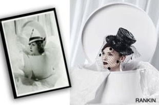
The original image hat box created 1930 with model Elsa Schiaparelli was Rankin’s first of the 7 photos he recreated. Rankin recreated this image with Artist/Model Sophie Ellis-Bexter using a digital camera instead of 10 by 8 camera (which shows the image upside down) as it was more difficult to really capture the image using that camera and wouldn’t of been able to see the finished image that day were as using digital Rankin would of been able to see a final image. I personally feel this image is nice and works well with using a digital camera as can capture the image very clear and shows the models features extremely well but I prefer the original as I feel it shows more emotion in the picture and because of when it was made and the camera used I like that it has that old school feel to it.

Erwin Blumenfeld

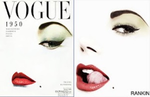
This image for Vogue Cover in 1950’s with Jean Patchett Rankin had got Heidi Klum to recreate, on the original image back  in 1950’s would of taken a while to actually create as technology was not as advanced as it is now. With this image Blumenfeld erased majority of the image leaving minimal details the eye, eyebrow, lips and beauty spot, as they didn’t have photo shop back then the bright colours they used for the makeup had to be painted on afterwards. I prefer the original image as for vogue this cover looks extremely strong you can tell a lot from photograph even though the hole face is not in the image but on the other hand I like how Rankin has modernised the image with Heidi letting her cheeky personality come through with her tongue showing.

Richard Avedon

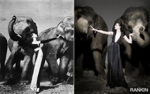
This Image Dovima with Elephants with Dorothy Horan (Dovima) 1955 was recreated using Erin O’Conner. Comparing the two images I love how Rankin’s picture is bold and as Erin has a nice pale complexion it makes it look just that much bolder which works well within this picture.  As modelling changes along the years you can see that in the original Dovimas body is more relaxed and its extremely elegant looking were as Rankin’s version Erin is sharp and more rigid, This works but with this particular image I do prefer the original as it looks like Dovima was just caught in a moment not actually modelling. Even down to the elephants they give a different feel to the picture as the elephants in the original are distressed and look as though they are struggling to become free from the chains and it looks as if Dovima is almost naturally soothing them, were as in the recreated one the elephants are not distressed at all and it appears to be the other way round Erin looks less comfortable and the elephants look fine almost statue like.

David Bailey

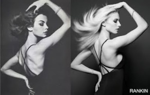
This image with Jean Shrimpton who was one of David’s previous lovers took a beautiful picture in 1960’s quiet seductive showing jeans feminine physic and this picture shows her features extremely well, her jaw line is very apparent and define a long side her lips, nose and her positioning of her body, her arm above her head elbow in line with her nose making everything look sharp. I think this picture is just beautiful and defiantly prefer the original more than Rankin’s recreated version with girlfriend Tuuli. The recreated version is still a lovely photo with the lighting and modernised look but I just feel in this version Tuuli looks almost flat I don’t know if it’s the positioning of Tuuli or the camera but if you look at Baileys original you can almost see the other side of Jeans face as if the lighting is bouncing of Jeans skin and features making the photo look more sharp and rounded were as in Rankin’s, Tuuli could almost pass as a painting or as if she had been glued onto the page.

Helmut Newton

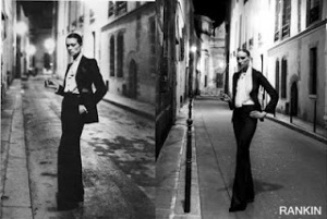
Rue Abriot Vogue 1975 this image and artist in fact is my favourite because like you will see in my write up about Mr Helmut Newton I love what his about and what he tries to get across with his photographs. This image is amazing I love the way Newton has a woman dressed in a suit looking masculine but very pretty in the face the model almost reminds me of Keira Knightly I would of used someone like her if I had to change anything about the picture. Out of all the pictures Rankin recreated this one I feel he did extremely well I like how he has done it on the exact same street and it shows in the pictures which one is modern and which one is not.
In the original picture the street looks worn its quiet gloomy and grungy and how the models standing and dressed with the attitude I feel coming off the model with her fag and facial expression I feel I am looking at an Italian gangster of some sort.
In Rankin’s recreated image I feel you can tell it is a model posing for a photograph as it doesn’t look as natural as the original, more posed like the models worrying about were to position her hands and concentrating on her facial expression other than that I do feel this was a very good recreation of the picture.

Guy Bordin

This image by Guy in 1970’s is one of the images I wouldn’t of picked to recreate, it’s a nice photograph but I feel there are other photos from Guy that I personally would have picked over this one for example,

 Or

I like Guys work a lot it’s unique with a different twist, A lot of Guy photographs I have seen without realising who the artist was for example in the Madonna video Hollywood she used a lot of guys work and on adverts and films I have seen his images in. With this image Rankin recreated I am unsure on it as it is a good photograph but the model and the clothes I am really unsure on. The original looks fun and quiet fresh were as Rankin’s photograph is quiet sexy and serious. I prefer the original but as a modern day photograph Rankin’s one does work.

Herb Ritts

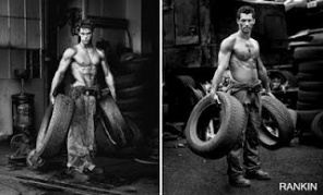
Fred with tyres 1984 this image works very well and Rankin has done a good job with this image, Rankin’s photo surprisingly looks quiet natural as if he caught Model David Gandy actually at work and he had got a quick snap whilst he was turning around. The original is a nice picture and from my research it was very hard for male models to be accepted in 1980’s they felt they had to hide the fact they was models as it was considered homosexual. The original image is actually modelling jeans although you wouldn’t have thought it. I do like both photographs the original and Rankin’s version I feel he did very well here.

Photography- Initial Research


Helmut Newton, born 31st October 1920 a German-Austrailian photographer who started photographing at the young age of 12.

In the 1970’s Newton’s work was almost frowned upon, Newton had a vision and expressed this extremely well within his photography. Newton wanted to free women from feeling trapped, as the word ‘woman’ didn’t always mean frilly dresses and heals. Newton thought of his photographs as stories that have no beginning, no middle and no end.

Newton’s photography showed mainly women dominating and a lot of role reversal. People found it hard to accept this, as feminism was extremely high in 1970’s and it caused an almighty scandal with newton’s photographs and people began to see Newton as an antichrist. To Newton there were two dirty words in photography ‘Art’ and ‘good taste’ Newton believed beauty was intellect and that glamour and nothing to do with money. Newton’s aesthetic was ‘Porno Chick’ to a lot of feminist’s.


Newton was against feminism and showed this within his photographs this is why , people would protest at his exhibitions by throwing paint at his photos.

Newton would also use elements of violence in his work and would have women half naked holding pistols, knives or other instruments discretely hidden from men unaware of their intentions. Newton used men in his photography but only ever used them as waiters or so called ‘on lookers’ women were his main focuses.

Newton was partially colour blind, which is why majority of his photos were black and white, but when colour was added he advised it had to be strong.

Newton was known to use a Rolleiflex 2.8 GX for majority of his photographs, He preferred shooting at night under lights and everywhere and anywhere but a studio.

 I have attached a few photographs created by Helmut Newton so you can see the different styles he would use. 


This picture i like because i find it rather sexual i like the way Helmut captured the smoke in the back ground and the way he has styled both women. The woman in the back looks more masculine than the woman in front but both there features are extremely strong and sharp which i feel makes the image. I Like the image but would  change the picture by having a woman in the back and a male in the front as i feel this would of made the photo look just that bit stronger and give more of the woman dominating feel to the photograph which is something Newton showed a lot within his work.

‘Woman Examining Man’ Saint Tropez 1975

This is my favourite image above all as i like what newton was doing here with the role reversal theme. I felt this picture showed the theme role reversal extremely well especially with the way that he has positioned both models. Newton has the woman on the sofa sat extremely un lady like with her examining the gentleman as if she was extremely proud of her man almost as if she had told him to stand in front of her and turn around so she can look at him from every angle possible and admire his beauty as such.

This is normally the role a man would play legs open hand on head after a sexual act had taken place making his woman stand in front of him semi nude so he can admire her, i love how newton managed to give off what he was thinking even with the male model not in the shot fully. The photo only really shows half a story yet you still get the gist of what the photograph is about and what newton is trying to get across.

I chose Helmut Newton to write about because of everything i have stated above i love the way he didn’t care about what others thought and regardless of the fact feminism was at a high when he started to photograph professionally he still went with his heart and put this in his photographs. He also showed a lot of photographs were dominating took place some people do in fact have a dominant and submissive relationship but never admit to it. People frown upon it or don’t actually believe it to be real and can be naive to it were as newton wasn’t afraid to show this within his photographs. I personally feel people like E.L James writer of 50 shades of grey maybe wouldn’t of had that sort of inspiration without artists like Helmut Newton. Helmut used to do pictures for play boy and they advised him even some of his photography was to raunchy for them but i like this about helmut as he had vision and wasn’t afraid to express his thoughts through his photography.